
A well-designed website is more than just a visually appealing platform—it plays a crucial role in building credibility, attracting visitors, and converting them into customers. However, many businesses and individuals unknowingly make common website mistakes that hurt their site’s performance, user experience (UX), and search engine rankings (SEO).
For example, a slow-loading website frustrates users and increases bounce rates, while poor mobile responsiveness can alienate a large percentage of visitors who browse on smartphones. Additionally, bad navigation, cluttered layouts, weak call-to-actions (CTAs), and broken links can confuse users, making it difficult for them to engage with your content or make a purchase. These common website mistakes not only affect usability but also reduce customer trust and credibility.
| Ready to Boost Your Website’s Performance? Get a Free Website Audit Now |
How Web Hosting Mistakes Damage Your Site’s Success
From an SEO perspective, these website design mistakes can significantly prevent your site from ranking highly on search engines like Google. For example, poor site structure, lack of mobile optimization, slow page speed, and excessive pop-ups can all contribute to lower search visibility. Moreover, among the biggest website mistakes is neglecting technical SEO, which can further make it harder for search engines to crawl and index your site.
Another crucial issue is web hosting mistakes: choosing an unreliable hosting provider can lead to frequent downtime, slow site performance, and security vulnerabilities. This is one of the website mistakes to avoid at all costs, as it directly impacts both user experience and search rankings.
Avoiding these top website design mistakes is essential if you want to create a user-friendly, high-performing website that not only looks great but also functions effectively to drive traffic, increase engagement, and boost conversions.
Here are the biggest website mistakes and how to avoid them.
TOP 10 WEBSITE MISTAKES NEED TO AVOID
- Poor Website Navigation
- Slow-loading spell
- Not Having a Mobile-Friendly Design
- Cluttered or Unattractive Website Design
- Weak Call-to-Action (CTA)
- Ignoring SEO Best Practices
- Choosing the Wrong Web Hosting
- Lack of Website Security
- Not Having a Blog for Content Marketing
- Ignoring Analytics and User Behavior Tracking
1. Poor Website Navigation Can Ruin User Experience.
A website with complicated menus, broken links, or unclear categories frustrates visitors and increases bounce rates. Common website design mistakes include excessive dropdowns, unclear labels, and missing search functionality. To fix this, ensure your navigation is simple, intuitive, and structured logically. For example, Amazon uses clear categories and a search bar, making it easy for users to find products. Need professional help? Check out our expert web design services.
How to Avoid Poor Website Navigation
- Use clear and straightforward menu structures.
- Limit dropdown menus to essential categories.
- Include a search bar for easy navigation.
- Use breadcrumbs to help users track their location.
- Regularly test and fix broken links.
Examples
- Amazon: Clear categories and a powerful search function.
- Nike: Intuitive navigation with a focus on products.
- BBC: Well-structured menus with easy access to news sections.
| Need Help Fixing Website Navigation Issues? Talk to Our Experts |
2. Slow Loading Speed – A Critical Website Mistake to Avoid
A slow website can drive visitors away and harm your search rankings. Website design mistakes to avoid include large, unoptimized images, excessive scripts, and poor hosting. Use compression tools like TinyPNG, minimize CSS and JavaScript files, and choose a reliable hosting provider. Book a consultation now to speed up your site instantly!
How to Avoid Slow Loading Speed
- Optimize and compress images.
- Minimize CSS, JavaScript, and unnecessary plugins.
- Use a content delivery network (CDN).
- Enable browser caching.
- Choose a high-performance hosting provider.

Examples
- Google: Lightning-fast page load speeds.
- Dropbox: Optimized images and minimalistic design.
- YouTube: Uses CDN and caching for faster video streaming.
| Is Your Website Slowing Down? Optimize Now |
3. Not Having a Mobile-Friendly Design
A non-responsive website is a common mistake, as most users browse on mobile devices. Ensure your design adapts to different screen sizes and provides a seamless mobile experience. Use Google’s Mobile-Friendly Test to check compatibility.
Need a fully responsive website? See how we build mobile-friendly sites.
How to Avoid a Non-Mobile-Friendly Website
- Use a responsive design framework.
- Test your website on different devices.
- Optimize images for mobile screens.
- Avoid pop-ups that interfere with navigation.
- Improve touch responsiveness for buttons and links.
Examples
- Facebook: Seamless experience across devices.
- Airbnb: Mobile-first design with smooth navigation.
- Spotify: Adaptive layout that adjusts to screen sizes.
| Build a Mobile-First Website That Converts Start Here |
4. Cluttered or Unattractive Website Design
Too much text, flashy animations, and poor color choices can quickly overwhelm visitors. In fact, common website design mistakes include using low-contrast colors, excessive pop-ups, and confusing layouts. Therefore, it’s best to stick to a clean, professional design with readable fonts and a logical content hierarchy.
A good example is Apple’s minimalist website. Explore our latest projects for inspiration!
How to Avoid Cluttered Design
- Use whitespace effectively.
- Stick to a simple color scheme.
- Limit fonts to two or three styles.
- Keep animations subtle and purposeful.
- Organize content using a grid layout.
Examples
- Apple: Minimalist, clean, and user-friendly.
- Medium: Simple typography-focused layout.
- Dropbox: Balanced whitespace and structured content.
| Time to Clean Up Your Design? Get a Modern, Professional Look |
5. Weak Call-to-Action (CTA) That Reduces Conversions
A website mistake to avoid is not having clear CTAs. Your CTA should be prominent, action-oriented, and compelling.
Examples include “Sign Up for Free” or “Get Your Discount Now.” Use contrasting colors to make CTAs

stand out.
Need optimized CTAs? Our experts can help.
How to Avoid Weak CTAs
- Use action-oriented language.
- Place CTAs strategically (above the fold, at the end of sections).
- Use contrasting colors to highlight CTAs.
- Make CTAs responsive and mobile-friendly.
- A/B tests different CTA designs and placements.
Examples
- Netflix: “Join Free for a Month” CTA.
- Amazon: “Buy Now” button with urgency.
- HubSpot: CTA forms optimized for conversions.
| Need High-Converting CTAs? Optimize Your Call-to-Actions |
6. Ignoring SEO Best Practices
Ignoring SEO can make your website invisible on search engines. Common website mistakes include not optimizing meta tags, missing alt text for images, and neglecting keyword research. A well-optimized site ranks higher on Google, attracting more organic traffic. Boost your SEO with our expert services.
How to Avoid Ignoring SEO
- Research and use relevant keywords.
- Optimize meta tags, headers, and URLs.
- Add alt text to all images.
- Improve internal linking structure.
- ReBoost Your SEO Rankings Today! Learn Moregularly update content for freshness.
Examples
- Moz: Strong on-page SEO practices.
- Neil Patel’s Blog: Keyword-optimized content.
- Wikipedia: Well-structured internal linking.
| Boost Your SEO Rankings Today! Learn More |
7. Choosing the Wrong Web Hosting
A poor hosting provider can lead to slow speeds, frequent downtime, and security risks. In fact, common web hosting mistakes include choosing cheap, unreliable hosting with limited support. Therefore, it’s important to always invest in high-performance hosting that ensures stability and security.
Check out our recommended hosting solutions.
How to Avoid Hosting Issues
- Choose a reliable hosting provider with good uptime.
- Ensure sufficient bandwidth and storage.
- Opt for managed hosting if you lack technical expertise.
- Use SSL certificates for security.
- Regularly monitor server performance.
Examples
- Bluehost: Reliable uptime and performance.
- SiteGround: Fast and secure hosting.
- Cloudways: Scalable cloud hosting solutions.
| Looking for Reliable Web Hosting? Get Expert Recommendations |
8. Lack of Website Security
Neglecting website security makes your site vulnerable to hackers and malware. Website mistakes to avoid include using weak passwords, ignoring software updates, and failing to install security plugins. Protect your site with firewalls and regular updates. Secure your website today.
How to Avoid Security Risks
- Use strong, unique passwords.
- Install SSL certificates.
- Regularly update WordPress/plugins.
- Enable two-factor authentication.
- Back up your website regularly.
Examples
- Google: Strong encryption and security measures.
- PayPal: Multi-layer authentication for transactions.
- Dropbox: Regular security updates and encryption.
| Looking for Reliable Web Hosting? Get Expert Recommendations |
9. Not Having a Blog for Content Marketing
A blog boosts SEO and establishes authority, yet many websites lack one. Standard website mistakes include not producing valuable content or failing to update the blog regularly. Blogging drives organic traffic and helps convert visitors. Start your blog with our content strategy.
How to Avoid Content Marketing Mistakes
- Publish high-quality, informative content.
- Use targeted keywords for SEO.
- Promote blog posts on social media.
- Update old content for relevance.
- Include internal links to boost engagement.
Examples
- HubSpot: Comprehensive inbound marketing blog.
- Neil Patel: Data-driven SEO and marketing content.
- Forbes: High-authority blog with regular updates.
| Protect Your Website from Hackers Secure Your Site Now |
10. Ignoring Analytics and User Behavior Tracking
Not tracking user behavior means missing insights into website performance. The biggest website mistakes include neglecting Google Analytics, heatmaps, and conversion tracking. Data helps you optimize design and content for better engagement. Set up analytics with our expert help.
How to Avoid Analytics Mistakes
- Install Google Analytics for data tracking.
- Use heatmaps to analyze user behavior.
- Set up goal tracking for conversions.
- Monitor bounce rates and session durations.
- Make data-driven website improvements.
Examples
- Google Analytics: Tracks user engagement.
- Hotjar: Heatmaps for behavioral insights.
- Facebook Pixel: Tracks ad conversions.
| Ready to Start Blogging for More Traffic? Set Up Your Blog |
COMMON WEBSITE DESIGN MISTAKE
A poorly designed website can drive visitors away before they even explore your content. Here are some of the common website design mistakes that hurt user experience, SEO, and conversions:
Slow Loading Speed
One of the biggest website mistakes is having a slow-loading site. If your website takes more than a few seconds, visitors will leave. Optimize images, use caching, and minimize unnecessary code to improve speed. Web hosting mistakes, such as choosing a slow or unreliable server, can also impact performance.
Example: A travel booking site takes 7 seconds to load, causing visitors to leave before checking deals.
✅ Tip: compress images, enable browser caching, and use a Content Delivery Network (CDN) to speed up loading times.
Check Your Website Speed—Is It Driving Visitors Away? https://pagespeed.web.dev


📱 Not Mobile-Friendly
With most users browsing on mobile, a website that isn’t responsive can lose a huge audience. A non-mobile-friendly design is one of the top website design mistakes that can reduce traffic and lower search rankings. Ensure your website adapts seamlessly to all screen sizes.
Example: A clothing store’s website looks great on desktop but appears broken on mobile, leading to lost sales.
✅ Tip: Use responsive design, test your site on different screen sizes, and ensure buttons are easily clickable on mobile.
Make Your Website Mobile-Friendly Today! https://pagespeed.web.dev
🗺️ Cluttered Layout & Poor Navigation
A messy design confuses users. For example, common website mistakes include overcrowded menus, too many pop-ups, and unorganized content. To avoid this, keep your navigation simple, use clear headings, and make important pages easy to find. As a result, you’ll enhance the user experience.
Example: A news website has too many ads, pop-ups, and a confusing menu, making it hard to read articles.
✅ Tip: Keep the layout clean, use intuitive menus, and limit distractions to guide users smoothly through your site.
Confused about navigation? Let’s Simplify Your Site!
🔗 Improve Your Website’s UX & Navigation
🔴 Weak Call-to-Actions (CTAs)
If your CTAs don’t stand out, visitors won’t take action. This is one of the biggest website mistakes businesses make. Use clear, compelling CTAs with contrasting colors and action-driven text like “Get Started Now” to improve conversions.
Example: A sign-up button blends into the background, making visitors unsure of the next step.
✅ Tip: Use bold colors, and action-oriented text (e.g., “Get Started Now”), and place CTAs where they are easily visible.
Boost Conversions with High-Impact CTAs!
🔗 Schedule a Free CTA Optimization Consultation
🔠 Unreadable Fonts & Poor Contrast
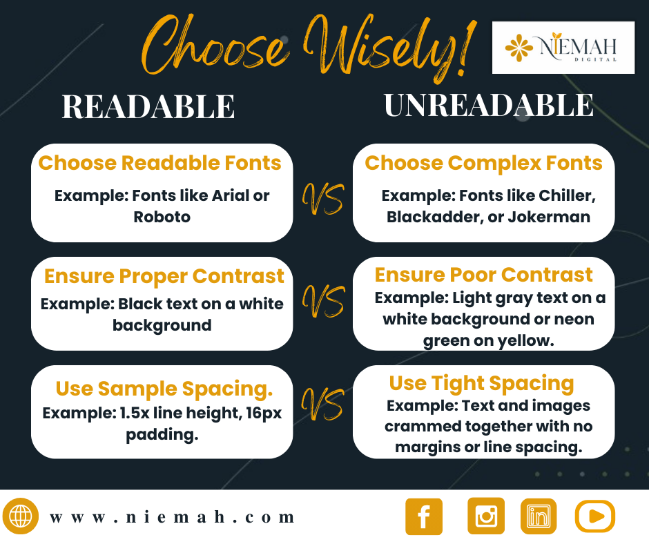
Using fancy or overly decorative fonts can make text difficult to read. Additionally, website design mistakes to avoid include small fonts, poor color contrast, and excessive text blocks. Instead, stick to legible fonts, proper spacing, and high contrast between text and background.
Example: A beauty blog uses a fancy cursive font with a light pink background, making text difficult to read.
✅ Tip: Choose simple, readable fonts like Arial or Roboto, ensure proper contrast, and use ample spacing.
Don’t Let Poor Design Cost You Customers – Get a Free Website Audit!
🔗 Request a Free Website Design Audit
⚠️ Overuse of Pop-Ups
While pop-ups can increase conversions, excessive or intrusive ones annoy users and drive them away. Website mistakes to avoid include aggressive pop-ups that block content or appear too frequently. Use them sparingly and ensure they are easy to close.
Example: A recipe website bombards visitors with pop-ups, causing frustration and high bounce rates.
✅ Tip: Limit pop-ups, ensure they are easy to close, and use exit-intent pop-ups instead of intrusive ones.
Are pop-ups killing your traffic? Fix It Now!
🔗 Enhance User Experience with Smart Pop-Ups
🔗 Broken Links and Errors
Nothing kills credibility faster than broken links or website errors. Regularly check and fix errors to ensure smooth navigation. A dysfunctional site is one of the common website design mistakes that lowers SEO rankings and frustrates visitors.
Example: A real estate site has broken links to property listings, leading to user frustration and lost business.
✅ Tip: Regularly audit your website for broken links using tools like Google Search Console or Screaming Frog.
Broken Links Are Hurting Your SEO—Get Them Fixed!
🔗 Check & Fix Your Website Errors
CASE STUDY: WEBSITE DESIGN MISTAKES & BEST PRACTICES
Introduction
A well-designed website not only enhances the user experience but also improves SEO and increases conversions. In this case study, we examine three websites—PaulHoyt, ReachYourPeakNow.com, and Niemah.com. Specifically, we aim to identify common website design mistakes and also highlight best practices.
- CASE STUDY
Website 1: Paul Hoyt
Problems
- Poor Image Placement: The testimonial section’s image overlaps with the banner, making the text unreadable.
- Inconsistent Alignment: Lack of structured layout and proper spacing makes the page look messy.
- Excessive White Space – Too much white space creates an unfinished appearance.
- Unreadable Text: Small font size and poor contrast affect readability.
- Confusing Navigation: The menu lacks hierarchy, making it hard for users to find key pages.
- Low-Quality Visuals: Pixelated images in the testimonial section reduce credibility.
- Lack of Clear CTA—No actionable buttons to guide users.
Footer Issues
- Weak Visual Hierarchy: Essential links are not well organized.
- Low Contrast & Readability: Copyright text blends with the background.
- No Clear CTA—Lacks interactive elements like “Download Free Resources.”
- Missing Essential Footer Elements No contact information, privacy policies, or quick links.
- Unnecessary White Space: Excessive gaps make the footer look empty.
Solution
- Redesign the layout for better alignment and image placement.
- Increase font size for readability.
- Optimize navigation and add structured menus.
- Improve image quality and contrast.
- Add clear CTAs to enhance engagement.
Result
If implemented, these changes would improve user experience, increase trust, and boost conversion rates.
02. CASE STUDY
Website 2: Reach Your Peak Now
WEBSITE 2
Problems
- Poor Contrast & Readability: Low text-background contrast reduces visibility.
- Logo Overlapping Content – Cluttered design affects professionalism.
- Blended Navigation Bar: The menu lacks distinction, making navigation difficult.
- Disorganized Footer
- Excessive empty space.
- Unclear social media icons.
- “Powered by GoDaddy” is distracting.
- Inconsistent Color Scheme: The dark red and black combination looks outdated.
Testimonial Section Issues
- Poor contrast: A red background with white text reduces readability.
- Inconsistent Font Styling: Different text styles affect professionalism.
- Floating Blank Space: Misalignment creates an unfinished look.
- Unclear Image Placement: Testimonial images do not align well with text.
- Dummy Pictures: Placeholder images need to be replaced with actual images.
Solution
- Improve text contrast and readability.
- Adjust logo placement for a clean layout.
- Redesign the navigation bar with better spacing and visibility.
- Optimize the footer layout with structured elements.
- Use a modern and visually balanced color scheme.
Result
Better visual hierarchy, improved readability, and a structured layout would enhance engagement and user retention.
03. CASE STUDY
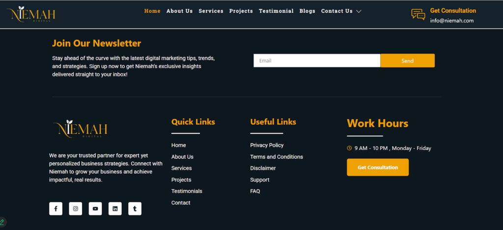
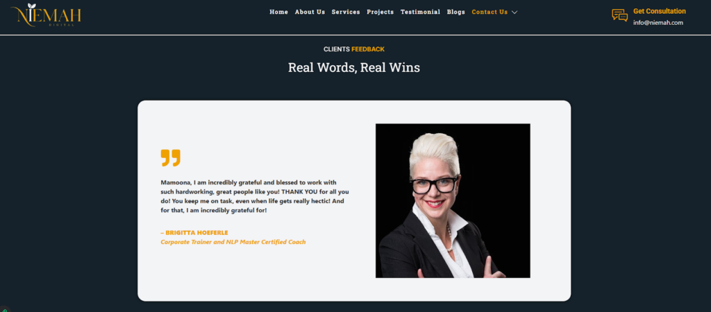
Website 3: Niemah
(Good Website Design Example)

Best Practices
✅ A clear and bold headline grabs attention and communicates value effectively.
✅ One of the highlights is the strong CTA (Call-to-Action); the “Get Started” button in yellow really stands out.
✅ The navigation is structured well, featuring a well-spaced and intuitive menu bar.
✅ Visual balance and branding are achieved through a modern dark theme with yellow accents, enhancing professionalism.
✅ Finally, the footer is well-organized, including essential links, contact info, and a newsletter subscription.
Testimonial Key Takeaways
- Consistent Font Styling – Testimonials maintain a uniform and professional look.
- Proper Image Placement – Images are aligned well with the text, enhancing credibility.
- Readable Contrast – The text stands out against the background, improving readability.
- Engaging Presentation – Testimonials are well-structured, making them easy to read and trust.
Key Takeaways
- Proper image placement and contrast improve readability.
- Strong CTAs guide users toward actions.
- Structured navigation enhances user experience.
- Balanced color schemes and clean layouts create professionalism.
CONCLUSION
PaulHoyt and ReachYourPeakNow face significant design issues; consequently, these affect user experience and conversions. Therefore, implementing structured layouts, clear CTAs, and improved readability would enhance engagement. In contrast, Niemah serves as an excellent example of effective web design. Moreover, prioritizing user-friendly elements leads to better SEO rankings, higher retention rates, and improved brand credibility.
Final Thoughts
1. Improve User Experience
A well-designed website should be user-friendly, fast, and engaging so that it keeps visitors coming back. Moreover, prioritizing clarity, functionality, and performance helps enhance user satisfaction and retention.
2. Focus on SEO and Conversions
Optimizing your website for SEO improves its visibility on search engines, leading to higher traffic. A conversion-focused design ensures visitors take the desired actions, such as making purchases or signing up for services.
3. Avoid Common Website Design Mistakes
Ensuring your site is structured properly, mobile-friendly, and fast-loading is essential because it prevents common pitfalls that hurt performance. Additionally, avoid cluttered layouts, slow load times, and poor navigation in order to maintain a smooth user experience.
4. Regular Audits and Updates
Consistently testing and updating your website keeps it competitive and aligned with the latest digital trends. Regular audits help identify and fix issues before they impact performance.
5. Invest in Professional Solutions
To achieve the best results, consider professional web design, SEO, and security services. Additionally, improving speed, navigation, and security can set your site apart from the competition and drive long-term success.
FAQs ON COMMON WEBSITE MISTAKES & HOW TO AVOID THEM
1. Why is website navigation important, and how can I improve it?
A poorly structured website confuses visitors and increases bounce rates. To enhance navigation, keep menus simple, use clear labels, add a search bar, and organize categories logically. Check out our professional web design services for expert assistance.
2. How can I speed up my website to reduce bounce rates?
Slow loading speed is a major website mistake that can drive visitors away. Optimize images, enable caching, minimize JavaScript and CSS, and choose a reliable hosting provider. Need help? Book a consultation with our experts for speed optimization.
3. Why does mobile-friendliness matter for my website?
A non-responsive website can significantly reduce traffic with most users browsing on mobile devices. A mobile-friendly design ensures better user experience and higher search rankings. Check if your website meets modern standards with our web design solutions.
4. What are weak CTAs, and how do I make them more effective?
A weak call-to-action (CTA) fails to engage visitors. Use action-driven language like “Get Started Now” or “Book a Free Consultation” with contrasting colors to attract attention. See how we optimize CTAs in our latest projects.
5. How does poor SEO affect my website’s visibility?
Ignoring SEO best practices means your website won’t rank well on search engines, reducing organic traffic. Implementing keyword optimization, meta tags, and internal linking can improve search performance. Learn more about how we enhance website SEO.
6. What are the risks of choosing the wrong web hosting provider?
Poor hosting leads to slow speeds, frequent downtime, and security vulnerabilities. Always choose a reliable hosting provider with strong uptime and security features. Need expert recommendations? Schedule a consultation.
7. How can I improve my website’s security?
Neglecting security can expose your site to hackers and malware. Use strong passwords, install SSL certificates, update software regularly, and enable two-factor authentication. See how we help businesses secure their websites in our case studies.
8. Is having a blog essential for my website’s success?
Yes! A blog boosts SEO, builds authority, and engages your audience with valuable content. Consistently updating your blog with informative posts can drive organic traffic. Learn how content marketing can benefit you by visiting our about page.
9. Why should I track user behavior on my website?
Analytics tools help you understand visitor behavior, identify problem areas, and optimize your website for better conversions. Google Analytics, heatmaps, and A/B testing can provide valuable insights. Read client testimonials about our data-driven website improvements.
10. How can I avoid common website design mistakes?
Regularly audit your site for slow speeds, poor navigation, weak CTAs, broken links, and security issues. A well-optimized, user-friendly website ensures better engagement and higher conversions. Need a professional review? Check out our website optimization services.

